Category Archives: Information visualisation
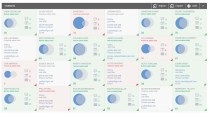
Romulus
A design task came my way last week for software start-up Romulus who have designed a sales management software tool. Their main business is flexible printed hospital screens but they have found that their network is interested in how to
Romulus
A design task came my way last week for software start-up Romulus who have designed a sales management software tool. Their main business is flexible printed hospital screens but they have found that their network is interested in how to
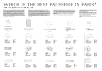
Best Patisserie in Paris
In Paris for a conference recently so alongside the more formal research I presented (related to social interaction design, and robotic displays but that’s a different post) I carried out some highly subjective research into Parisian patisseries. Five participants were
Best Patisserie in Paris
In Paris for a conference recently so alongside the more formal research I presented (related to social interaction design, and robotic displays but that’s a different post) I carried out some highly subjective research into Parisian patisseries. Five participants were
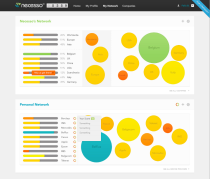
Necesso
These screens are for a start up called Necesso which is all about managing your online profile. The company aims to be a kind of marketplace agent finding you good deals by allowing you to share your data with companies
Necesso
These screens are for a start up called Necesso which is all about managing your online profile. The company aims to be a kind of marketplace agent finding you good deals by allowing you to share your data with companies
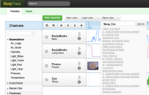
BodyTrack/Fluxtream
Just finished working on this application. BodyTrack is a CREATE Lab project from Carnegie Mellon University run by the brilliant Anne Wright and Fluxtream a start up run by Candide Kemmler. Both applications attempt to aggregate personal measurement
BodyTrack/Fluxtream
Just finished working on this application. BodyTrack is a CREATE Lab project from Carnegie Mellon University run by the brilliant Anne Wright and Fluxtream a start up run by Candide Kemmler. Both applications attempt to aggregate personal measurement

Inuit Genealogy
Currently working on a research project related to Canadian and Greenland Inuit with R0gMedia in Berlin. The diagram above is a genealogical diagram made in the mid 1950s by anthropologist Jean Malaurie, the first of its kind. It’s a hand
Inuit Genealogy
Currently working on a research project related to Canadian and Greenland Inuit with R0gMedia in Berlin. The diagram above is a genealogical diagram made in the mid 1950s by anthropologist Jean Malaurie, the first of its kind. It’s a hand

Data visualisation 1 – Apples to Apples
This is the first in a series of videos exploring some of the basic organising principles behind data visualisation. My intention is to give viewers a way of recognising these concepts when they encounter them in everyday graphs, charts and
Data visualisation 1 – Apples to Apples
This is the first in a series of videos exploring some of the basic organising principles behind data visualisation. My intention is to give viewers a way of recognising these concepts when they encounter them in everyday graphs, charts and

News magnifier
I’ve been working on a project related to online news. The problem we’re trying to address is that while the daily printed paper embodies recency (each new edition carries the latest news), online news hides the mechanism of change within
News magnifier
I’ve been working on a project related to online news. The problem we’re trying to address is that while the daily printed paper embodies recency (each new edition carries the latest news), online news hides the mechanism of change within

Drawings
I’ve been making these hand drawn wireframes that attempt to map out some ways of correlating different self reported healthcare metrics. Making these drawings raised some questions about how information is read and understood. How much does the layout and
Drawings
I’ve been making these hand drawn wireframes that attempt to map out some ways of correlating different self reported healthcare metrics. Making these drawings raised some questions about how information is read and understood. How much does the layout and

Mafiosi
First version of mafia connections map. Started with the list of names on the left so lots of research necessary to get to version on right. I think this shows some of the problems of information design, designers often pack
Mafiosi
First version of mafia connections map. Started with the list of names on the left so lots of research necessary to get to version on right. I think this shows some of the problems of information design, designers often pack

Polaroid Hunter
An interactive tool for a photographic retailer inundated by requests for Polaroid film. The Polaroid Hunter tracks current existing sales of Polaroid film in real time. Spin the clock-face wheel, find the film you want and go through to ebay
Polaroid Hunter
An interactive tool for a photographic retailer inundated by requests for Polaroid film. The Polaroid Hunter tracks current existing sales of Polaroid film in real time. Spin the clock-face wheel, find the film you want and go through to ebay
